Pie Charts
Definition
.png)
|250px
A pie chart is another way of showing the distribution of data with a discrete data set.
Reading Pie Charts
If the percentage of each slice of the pie chart is given, simple multiply this by the total amount of data to calculate how many pieces of data each slice represents. If the data is not given on the pie chart you can still calculate the percentage each slice is worth or how many items of data are in each slice (if given the total amount of data). To calculate the percentage each slice is worth, measure the angle of each slice and divide this by $360$ then multiply it by $100$. To find the number of pieces of data each slice represents, multiply the percentage that each slice is worth by the total number of the data sets.
Worked Example
Worked Example
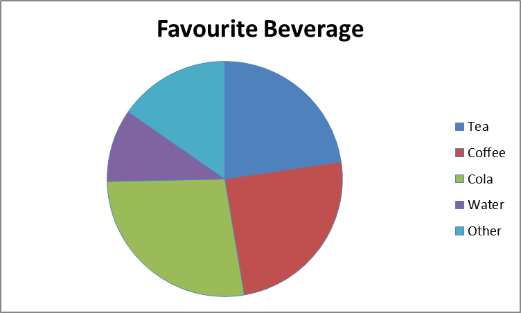
The total data set contains $150$ people. The people surveyed were all asked what their favourite non-alcoholic beverage is; these are their responses.

|400px
How many people's favourite beverage is tea?
Solution
To work this out, first you need to measure the size of the tea section with a protractor; it is $81.6°$. To find the percentage of the population that the sector represents, divide the size of the sector by $360$ and then multiply it by $100$.
\begin{align} \frac{81.6°}{360°}&=0.22\dot{6}\\ 0.22\dot{6}\times100&=22.7\%\ \text{(3.s.f.)} \end{align}
To calculate the exact number of people whose favourite beverage is tea, multiply $0.22\dot{6}$ by $150$ (the total number of people surveyed).
\[0.22\dot{6}\times150=34\]
This means that $34$ selected tea as their favourite non-alcoholic beverage.
Video Example
This is Khan Academy's video on reading pie charts.
Creating Pie Charts
When creating pie charts you should avoid design elements, 3D effects and exploding slices. These can produce optical effects that make it hard to compare different categories and may even be misleading.
Worked Example 2
Worked Example
Draw a pie chart for the grades achieved by $50$ pupils in their end-of-year exam.
|
Grade |
Frequency |
|---|---|
|
A |
$8$ |
|
B |
$21$ |
|
C |
$12$ |
|
D |
$5$ |
|
E |
$4$ |
Solution
1. Firstly calculate the total frequency. In this case the total frequency is $50$ as there are results from $50$ pupils' end of year exam.
2. Next, calculate the percentage of the total for each piece of data by dividing each one by the total frequency.
Note: Check that the sum of the 'Frequency \(\div\) Total Frequency' column equals $1$.
|
Grade |
Frequency |
Frequency \(\div\)Total Frequency |
|---|---|---|
|
A |
$8$ |
$\dfrac{8}{50}$ |
|
B |
$21$ |
$\dfrac{21}{50}$ |
|
C |
$12$ |
$\dfrac{12}{50}$ |
|
D |
$5$ |
$\dfrac{5}{50}$ |
|
E |
$4$ |
$\dfrac{4}{50}$ |
|
Total $=\dfrac{50}{50}=1.00$ |
3. Calculate the size of each slice of the pie chart by multiplying the 'Frequency \(\div\) Total Frequency' by $360$ (as there are $360$ degrees in one circle.)
Note: To check that your calculations are correct make sure that the sum of the 'Degrees of a circle' column equals $360$.
|
Grade |
Frequency |
Frequency \(\div\)Total Frequency |
Degrees of a Circle |
|---|---|---|---|
|
A |
$8$ |
$\dfrac{8}{50}$ |
$0.16\times360=57.6$ |
|
B |
$21$ |
$\dfrac{21}{50}$ |
$0.42\times360=151.2$ |
|
C |
$12$ |
$\dfrac{12}{50}$ |
$0.24\times360=86.4$ |
|
D |
$5$ |
$\dfrac{5}{50}$ |
$0.1\times360=36$ |
|
E |
$4$ |
$\dfrac{4}{50}$ |
$0.08\times360=28.8$ |
|
Total $=\dfrac{50}{50}=1.00$ |
Total $=360.0$ |
4. Use a compass to draw a circle.
.jpeg)
|225px|text-top|Draw a circle using a compass.
5. Use a ruler to draw the radius of the circle. Draw a line from the exact centre of the circle to the outside of the circle.
.jpeg)
|225px|text-top|Draw the radius of the circle.
6. Place your protractor at the centre of your circle so that the $0$° line matches up with the radius.
.jpeg)
|225px|text-top|Line up the protractor with the radius of the circle.
7. Draw the first slice by marking a dot at the appropriate angle. Draw a line from this point to the circle.
.jpeg)
|225px|text-top|Draw the first slice.
8. To draw the rest of the slices rotate your protractor so that the $0$° line matches up with your new lines. Continue doing this until you have completed your pie chart.
Note: To check you have drawn it correctly measure the angle of the last slice and see if it is the same as the angle in your table.
.jpeg)
|225px|text-top|Line up your protractor with your new slice.
Remember to label each slice of your pie chart.
.jpeg)
|225px|text-top|A complete pie chart.
Common Errors

|325px
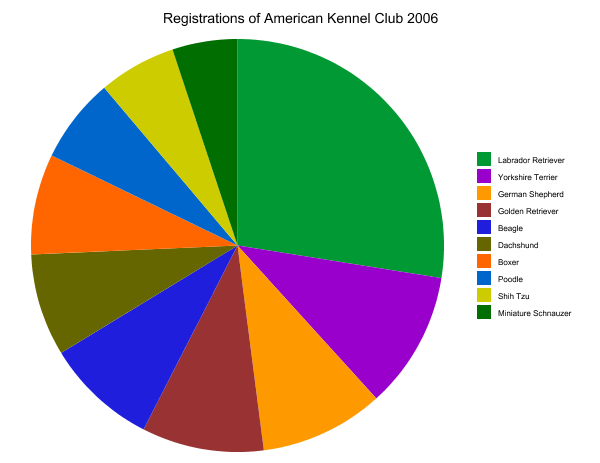
Common mistakes include using a pie chart when it is not appropriate to do so. If your pie chart has too many slices it makes it hard to see the difference between them. Also if your slices are a very similar size it is hard to clearly see which is bigger.
Workbook
This workbook produced by HELM is a good revision aid, containing key points for revision and many worked examples.
- Descriptive statistics including work on pie charts.
Test Yourself
- BBC Bitesize's test on interpreting pie charts and frequency diagrams
- BBC Bitesize's test on drawing pie charts
External Resources
- Pie Charts and Frequency Diagrams at BBC Bitesize