Displaying Data (Psychology)
Introduction
When working in psychology, you will be required to describe the information you are given to make trends and predictions. It is often easier to do this if your data is clearly displayed. This can be done via graphs, such as histograms, box plots, stem and leaf diagrams, scatter plots and pie charts (all of which can be made using a computer program such as R, Microsoft Excel or Minitab).
Stem and Leaf Diagrams
If we had data such as: $16,22,5,19,29,2,13$ we could display it in a stem and leaf plot to make it clearer. Firstly, we would decide on an interval width (e.g. go up in $10$s) This would give a stem unit of $10$ and leaf unit of $1$. The stem and leaf plot for the above data is: 
Where $n = 8$ , stem unit = $10$, leaf unit = $1$
Note: If your sample size is large you can split each row up into two or more rows $($ e.g. $10-14$ and $15-19)$.
This method of displaying data spreads out the values accordingly and makes analysis easier.
Bar Charts
Bar charts display frequencies (similar to a histogram) however the data must be discrete. When drawing these, remember to leave clear gaps between the bars and that the $y$-axis must cover the entire range of frequencies. Often bar charts are used to represent qualitative data such as ethnic diversity in a workplace. See also Bar Charts for a more detailed explanation.
Histograms
You can think of simple frequency histograms as bar charts for continuous data (although they can be used for discrete data), however, you need to split up the range of data into segments (class intervals).
For example, you could use a histogram for where you are recording the heights of children from different geographical locations to investigate how much environment impacts development. Note: Frequency is the amount of values in each chunk. Relative frequency is the proportion of values which lie in a chunk (interval), they are calculated by dividing the frequency of one interval by the total number of data values you have.
For a more detailed description see histograms.
Scatter Graphs
Say you have two sets of data values that you want to compare such as children's weight at $11$ years old and how old their mother is. The best way to represent this data if you are checking for a correlation (relationship) between them is a scatter graph. To draw a scatter graph for this example plot the mother's weight along one axis and the child's weight along the other and see if there is a correlation. (Minitab will do this for you)
For further information see scatter graphs.
Box and Whisker
A box and whisker plot or diagram (otherwise known as a boxplot), is a graph summarising a set of data. The shape of the boxplot shows how the data is distributed and it also shows any outliers. It is a useful way to compare different sets of data as you can draw more than one boxplot per graph. These can be displayed alongside a number line, horizontally or vertically.
For further information see box and whisker plots
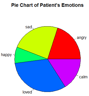
Pie Charts
If you are working with a discrete set of data, such as the different emotions a patient experience in one day .You could represent this data in a pie chart where each segment of the circle represents the proportion of the day that they experienced this emotion (see below).
Note: the sum of the segments must mean something significant e.g. all of the emotions experienced by a patient in one day .
For further information see pie charts.
Worked Example
Important Note
The examples covered on this page are purely hypothetical and any results or data are not from any real studies nor cases. The purpose of them is to demonstrate how to use the various statistical methods covered in this section.
Worked Example - Histogram
Draw a histogram to represent the data below about number of spousal abuse incidents per day.
No. of reported incidents: $ 0, 0,1,2,2,3, 4,4,4,4,4,5,6,6,6,7,7, 8,8,8,8,9,9,9,10,10,10,11,11,11, 12,13,14,14,15.$
Solution
First collect and order the data then split it into appropriate intervals. It is often easier to see the data if you input it into a table:
|
Class |
Frequency |
Relative Frequency |
|---|---|---|
|
$0-3$ |
$6$ |
$\dfrac{6}{35}$ |
|
$4-7$ |
$11$ |
$\dfrac{11}{35}$ |
|
$8-11$ |
$13$ |
$\dfrac{13}{35}$ |
|
$12-15$ |
$5$ |
$\dfrac{5}{35}$ |
|
Total |
$35$ |
As you can see there are $35$ data values so each relative frequency is the frequency for the interval divided by $35$. Inputting our data into Minitab (or R Studio), we obtain the following histogram and as you can see the relative frequencies are displayed on the $y$-axis and the sales (class interval) along the $x$-axis. This makes the data more understandable, you can see clear trends and are able to make further inferences.
.png "| centre")
| centre
Examples of Displaying Data
Above we have seen different ways in which data can be displayed. By displaying data we can observe the change in mean, standard deviation or inter quartile range.
Change in Mean


Here we can clearly see that the mean is larger for the first set of points than the second set of points because the first set of points is clustered much further to the right. The green line which represents the mean $x$ value is therefore also further to the right in the first scatter plot.
The change in mean can also be seen by comparing the box and whisker plots. The bold line in the box represents the median $x$ value, in this case since there are a large number of points the mean is approximately the median. This line is further to the right in the first box and whisker plot than in the second.
Finally, this difference between the two means can also been seen by comparing where the peaks of the histograms occur.
We can also deduce that the standard deviation stays the same by the fact that the spread of the points in each scatter plot are the same and the spread of the bars of the histogram are the same. It can also be seen by the width of the box in the box and whisker plot.
Change in Standard Deviation


Here we can clearly see that the mean is the same for both sets of data from the green line in the scatter plots, the median line in the boxplots and the peak in the histograms.
The main difference between these data sets is the spread, or the standard deviation. The standard deviation is larger for the first set of points than the second set of points because the first set of points is are spread out whereas the set set are tightly clustered about the mean.
The change in standard deviation can also be seen by comparing the spread of the histograms. As with the scatter plots the histogram shows that the data is more spread out in the first data set. Hence the first data set has a larger standard deviation.
We can also deduce that the inter quartile range stays the same due to the width of the box in the box and whisker plot being the same.
Change in Inter Quartile Range


When comparing these two sets of data they initially look very similar. The means are the same and so is the standard deviation.
However, when looking more closely at the second scatter plot we can see that most of the points are clumped around the mean but spread out to fill the same area as those in the first.
If we then compare the boxplots we see that the box, the width of which corespondent to the inter quartile range, is much smaller for the second data set.
Hence we can conclude that the mean and standard deviation of each set are the same but the inter quartile range for the second data set is smaller.
See Also
For more information on the topics covered in this section see presenting data.