Structure
Where and in what order to present your content on your academic poster.
While Western readers tend to read text from left-to-right and top-to-bottom, academic posters give you the opportunity to alter the audience’s experience of your work by allowing more control over where and how their eye moves across the page.
Think about where you want the audience’s gaze to ‘enter’ and ‘exit’ the page, and in what order (if any) you want them to move between different sections. Ask yourself:
- How do I want the audience to ‘read’ the poster? In columns? From left to right across the page? From the bottom up? To jump around between different sections?
- How will I guide their eye around the page? Using arrows? Different colour backgrounds? Boxed off sections? Shapes? Headings?
- How will I show them where to enter and exit the page? Images? Signal words? Different size or font for my text?
Playing with the structure can make your poster more visually appealing, but more importantly it can help re-enforce your message and enhance the audience’s comprehension of your work. For example, if you want to communicate how you developed a theory or methodology from the ground up, you could visually compliment this ‘building’ movement by inviting the audience to ‘start’ at the bottom of the page and working up through the different layers. Or, if you want the audience to take a non-linear route through the poster, you could try drawing their attention to the middle of the pages and then allow them to look at different sections without setting a specific path.
However, if the structure of your poster doesn’t fit the purpose it can be confusing for the audience. For example, a poster that aims to demonstrate a very specific, ordered methodology, probably wouldn’t work well with a non-linear structure. When thinking about how you want to structure your academic poster, ask yourself: does it complement or clash with my message?
For each of the following examples you can download a full PDF version of the image displayed.
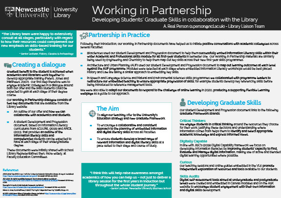
Example 4
This poster creates a linear structure through the use of numbering, subtitles and font size to guide the audience’s eye across the poster from left to right. This linear sequencing emphasises the causal connections that link its steps, helping the reader see how the aim impacts the design, which in turn impacts the process and next steps. This can give the project and poster a coherence in the mind of the audience, but might also raise questions about how strong these connections are (e.g. how exactly does the design respond to the issues raised in the aim?) and how the ‘Developing Graduate Skills’ section fits into this approach.
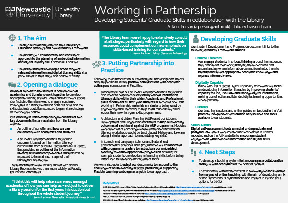
Example 5
This poster draws the eye in with the ‘Aim’ subtitle and from there the audience is free to pick and choose which of the other section they look at and in which order. This structure emphasises outcome rather than process and can give the audience more freedom to decide on what they’re interested in, but it might also leave them wondering if any of these aspects precede or are more important than the other.