Buttons
Buttons should prompt your users to complete a task, for example buy, order, book, enquire, contact. They can be used for in-page navigation and calls to action (CTA).
Add buttons to your page using the content type [ZEP] CTA Button. Your button text should be short and descriptive. We recommend two to four words. The text should be sentence case.
Individual buttons will appear on the left side of the page. By default in-page buttons will be a call-to-action (yellow colour).
Buttons can also appear within headers and promo banners. Ensure the colour and function is appropriate for the area of your site, as this will not be set automatically.
Next step button
The next step button allows a user to begin or continue a process, it acts as a ’next step’ ‘to start a process’. It's usually placed at the end of a paragraph allowing the user to ‘View our courses’, ‘Get help and advice’ or ‘Find a supervisor’.
It can also be a continue button if a process is spread across several pages, for example completion of part 1, moving on to part 2.
Use the settings in the content type to change to a next steps or forward path button (light blue). Add your text and link in, but also check the box that says "Make this a link" before approving.
Adding buttons in the page header
You can add buttons to your page header to help users navigate to an important task. Add a new section as a child of your page section. Call it Zephyr Section CTA Links. Within that section, add the CTA button component with button text and link.
You can add four buttons to the header. That means you can add four CTA button components in the Zephyr Section CTA Links section. To enable the CTA buttons, click the checkbox in the Standard Page Header of your page section.
Now, there are three types of button you can have in the header of your page. They have distinct functions. They work in different ways when you add a CTA button component to the sub-folder.
Call-to-action (or the "yellow one")
This is the default. If you put your text and link in and approve, you'll end up with a yellow call-to-action button. But that might not be what you need. The yellow call-to-action button has a specific function.
It's a transactional call-to-action. That means you're looking for the user to contact you in some way and give their details away. It might be they're filling in a lead capture form. They could be emailing for more information or paying for something.
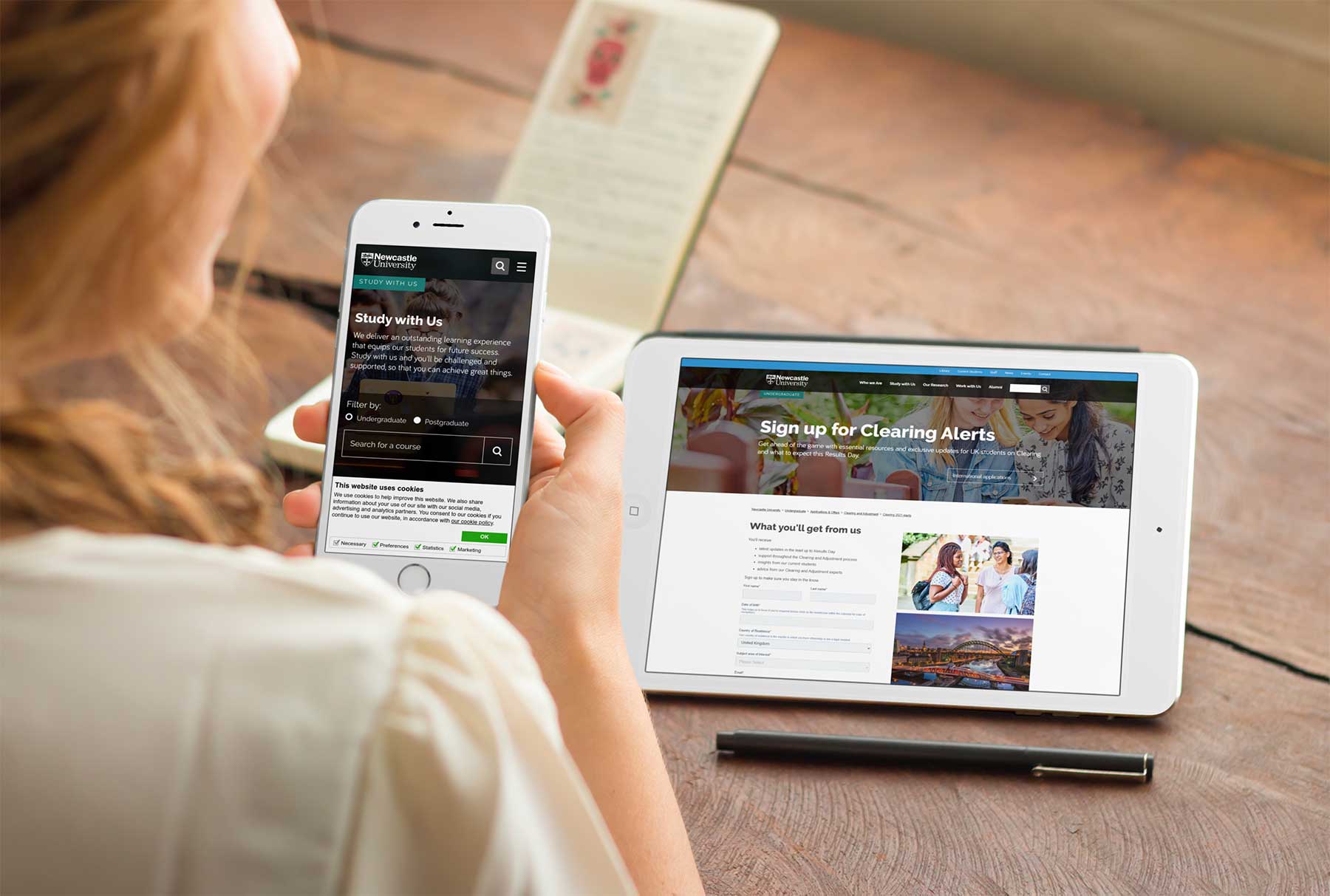
During Clearing, we have a transactional call-to-action in the landing page header. It's for users to sign up for Clearing Alerts. It's a yellow button that leads them to a form to fill in. We then have their details to send them our email communications about Clearing.
This is the context for employing a call-to-action button (the "yellow one").
Forward path (or the "light blue one with the arrow pointing right")
So for this one, you add your text and link in, but also check the box that says "Make this a link" before approving. I know what you're thinking. Why do we need to link people away from the page they've landed on from the page header? Seems crazy you'd think.
Sometimes users land on a top level page. We want to quickly navigate them to the task they're looking to complete. They don't want to scroll through the page they've landed on to find the link, and you don't want to hold them up.
With Clearing, international students have a different late applications process to UK students. They'll arrive on our Clearing pages looking for what's available. We need to quickly direct them to our international offering.
For this, we need a forward path button that leads them to the information that's pertinent to them. The page we are linking them to will hold that information. We need to get them on the right path.
Please don't use the section link option within the component. Why? Well the page will display a jump link button, which users will think is sending them down the page. But you're sending them to a different page, so that'll be confusing. Just pop your url in and check the "Make this a link" box for your foward path link.
Jump link (or the "light blue one with the arrows pointing down")
Sometimes you'll find you have a long page. That's particularly true when you're encompassing lots of related information. Course pages, research group pages and facilities spring to mind as examples.
Helping users get to the elements of the page they're most interested is important. Jump links are a good way to do this.
To set up a button to act as a jump link, add your text and use the content link button. Link to a component within your page section. This will allow users to click on the relevant header button and go straight down the page to what they want to see.
Consistency is key
It's important to be consistent in how you use buttons. Users will build an idea of how websites work based on continued interaction with them. They'll come to expect a green button is a transactional call to action and that a jump link sends them down the page.
If the buttons don't act in the way they expect, this can lead to confusion. Confusing your users doesn't leave them with a great experience. It discourages them from continuing their journey to complete a task.
Top Tips for CTAs
Avoid distracting content
Avoid using CTA Buttons alongside content that might distract your user from your goal.
For example, using multiple images or videos, hyperlinks or Key Messages grids will encourage your user to focus on that content rather than clicking on the CTA button to complete the task you want them to.
Placement
Your button should be the climax to a short story for your user:
- Introduction - brief context of what the page is about
- Rising action - instructive content for your users about how to join/get involved/book/buy/sign up etc
- Climax - your call to action
Try to keep your button towards the top of the page, making it easy to spot on all mobile devices.
Don't put your button on a separate page, away from your content. Often you will have text explaining to the user what to do, how to make a booking/when the visit day takes place - keep the button with this explanation to make sure they engage.
Use one button per page - too many will confuse the user over which one to use.
Expandable Content
If you have lots of detail to explain that relates to your CTA, use expandable content. This helps you to add the context you need to the page and keeps the button visible to the user.