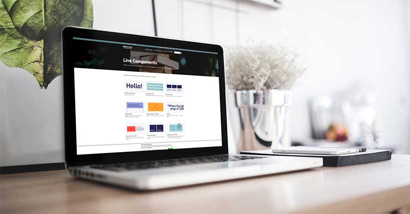
Digital Design Services
This website gives examples of all components available within the Newcastle University Digital Design System, guides on how to use them, and information about our web content standards.
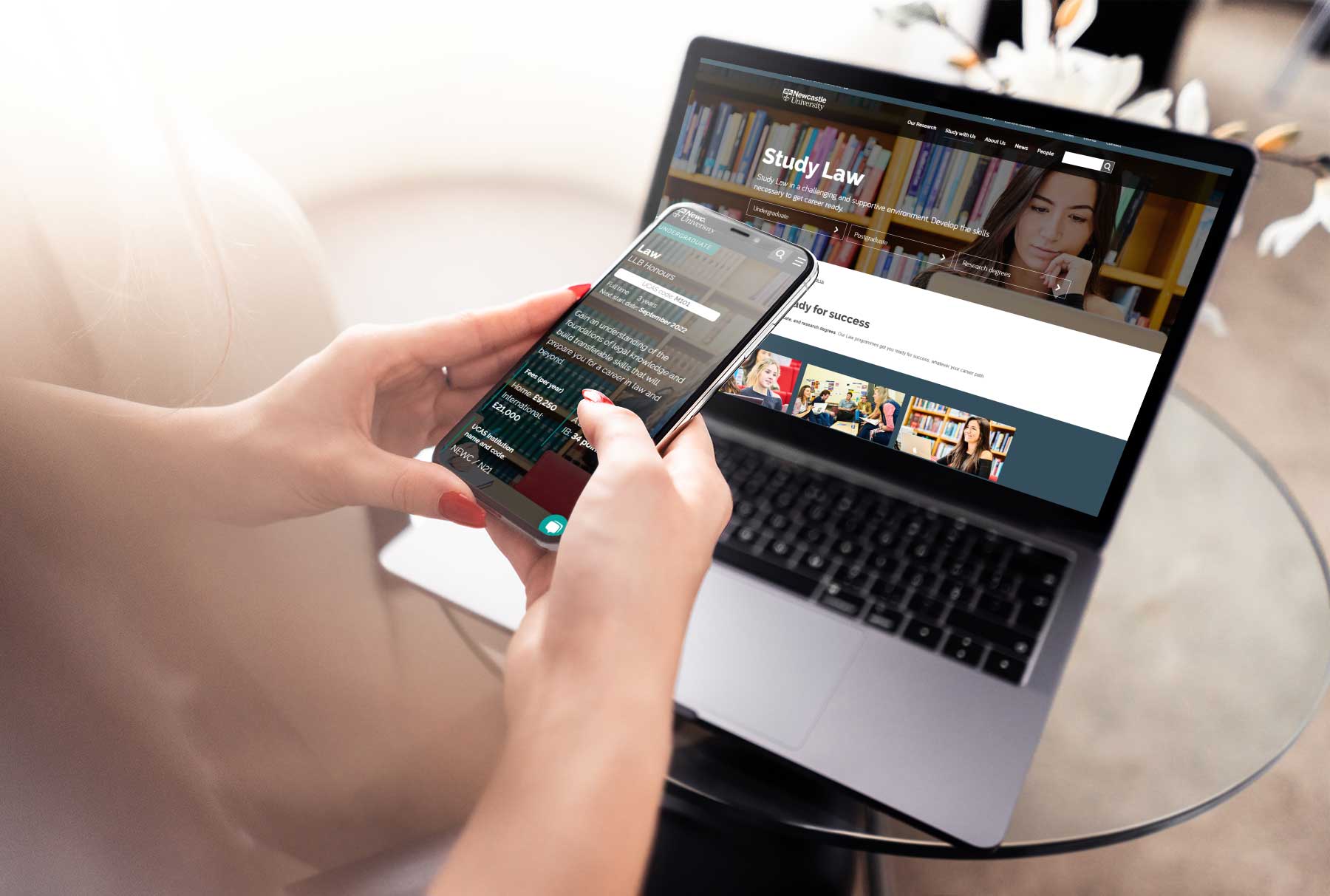
Content design and production
See examples of all content components in our design system, and instructions detailing how to use them. All content created for www.ncl.ac.uk should follow the University's editorial standards, and adhere to our image guidelines.
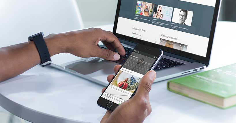
UX and content design


Wireframing and development
All developments to the Newcastle University design system are assessed by the Design Authority team at Newcastle University. We conduct extensive user research, user testing, and browser testing before we release updates. We aim to achieve a AA or AAA web accessibility rating for everything we produce.
Sometimes we work with external delivery partners to help improve or add to the design system. Useful resources for designers and developers can be found below.
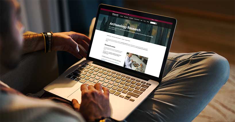
Our web template
About this website
This website is run by the Digital Team at Newcastle University.
Most photography used on this website comes from Unsplash, and most of our graphics are from Humaaans. Our placeholder images are generated by Placeholder, and our placeholder text is from Lipsum.